QR codes are everywhere now. Restaurant menus, conference badges, product packaging, flyers on telephone poles. Most people scan them without thinking too much about it. Most people creating them also don’t think too much about it — which is why so many of them are quietly failing.
This post is about making QR codes that actually work: ones that scan reliably, look like they belong to your brand, and let you know when they’re being used.
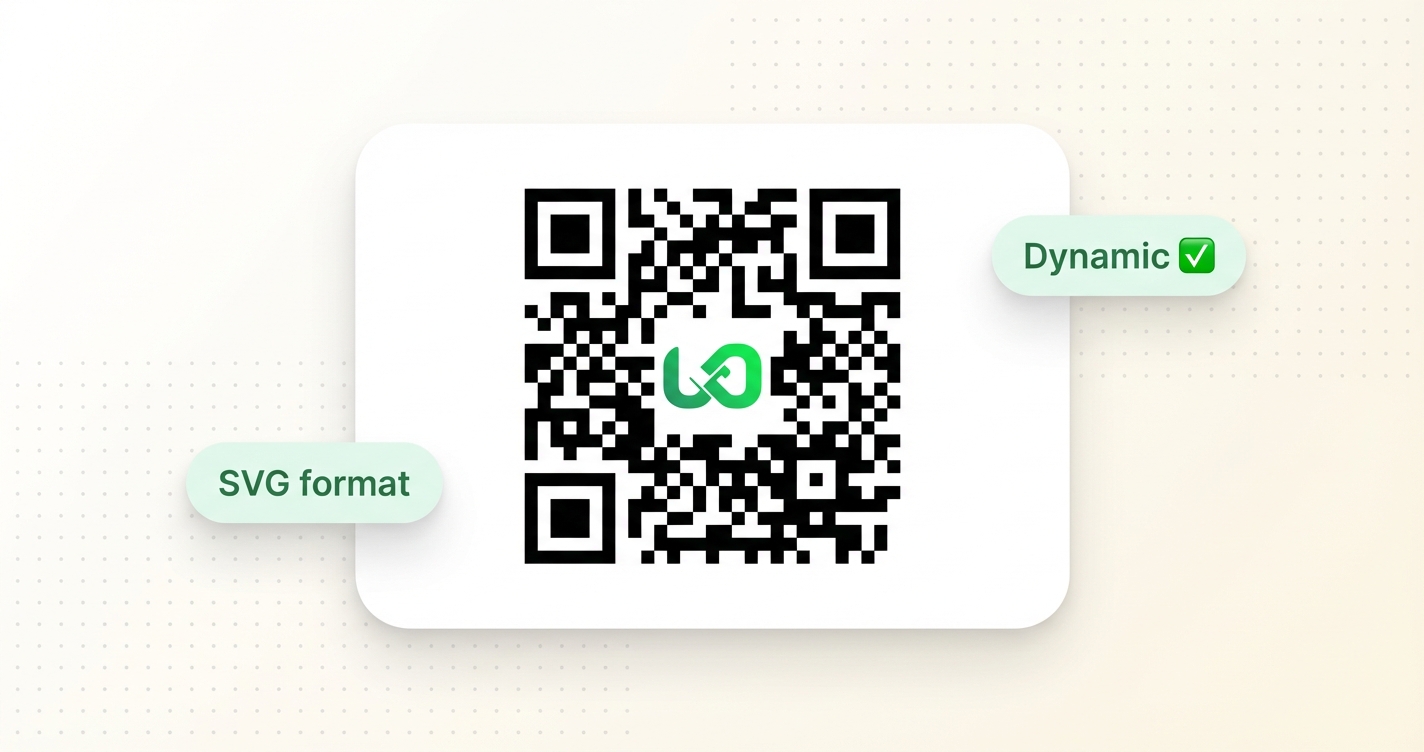
The most important thing to understand about QR codes is the difference between static and dynamic.
A static QR code encodes the destination URL directly into the pattern of the code. The destination is baked in — if you print it and then need to change the URL, you need a new QR code. There’s no tracking, no analytics, no way to update it.
A dynamic QR code encodes a short URL instead of the final destination. The short URL redirects to wherever you’ve set it to go. You can update the destination any time without changing the QR code itself. Analytics are tracked. And because the short URL is compact, the QR code itself can be simpler and more scannable.
If you’re printing QR codes on anything physical — packaging, signage, business cards, printed materials — use dynamic QR codes. The ability to update the destination after print is alone worth it.
When someone hovers over a regular link, they can see where it goes before clicking. QR codes don’t give you that. You point your camera, and it either shows you a preview URL or it just opens. Some people have turned off QR scanning altogether because they got burned once.
This is why having a recognisable domain on your QR code matters. When someone’s camera app shows them go.yourbrand.com/menu before they tap, they know where they’re going. When it shows them bit.ly/xk2r9 — or worse, a URL they’ve never seen — they hesitate. Some of them don’t tap at all.
Putting your custom domain on your QR codes is one of those things that feels small but has a real effect on scan rates.
Links on Link generates QR codes in three formats. Here’s when to use which:
PNG is a raster image — pixels. Good for: embedding in documents, uploading to tools that need an image file, printing at small sizes. The downside is that if you scale it up significantly, it gets blurry. Generate at a large enough size for your use case.
SVG is a vector format — it scales to any size without quality loss. Good for: print materials, anything that might be reproduced at different sizes, professional design workflows, signage. This is the format to use if a designer will be incorporating it into a layout.
Data URL is the QR code encoded as a base64 string — basically the SVG inlined into text. This is mostly useful for developers embedding QR codes directly into web pages or documents without hosting a separate image file.
For most physical print use cases, SVG is the right choice. For digital use and quick sharing, PNG is fine.
QR codes work by creating contrast between dark and light squares that a camera can read. The camera doesn’t care what colours you use as long as the contrast ratio between them is high enough to distinguish.
This means you can use brand colours in your QR codes — and if your colours have enough contrast, they’ll scan just as reliably as black-and-white. A dark navy on cream scans fine. Light grey on white will fail.
Error correction is a tolerance feature built into QR codes. It controls how much of the code can be obscured or damaged while still scanning correctly. There are four levels: L (7%), M (15%), Q (25%), H (30%).
Higher error correction makes the code more reliable when something is covering part of it — like a logo, a label, or the wear and tear on a printed surface. The trade-off is that higher error correction requires more dense patterns, which means the code can’t be printed as small. For most uses, M or Q is a good default. If you’re adding a logo in the centre of the QR code, use H.
A standalone QR code with no context around it is a bit ambiguous. People know they should scan it, but they don’t know why. Adding a frame — a simple border with a label like “SCAN TO ORDER” or “OPEN IN BROWSER” — removes that ambiguity and increases the scan rate.
Links on Link has a few built-in frame styles: none (just the QR code), rounded (a clean rounded border), and scan (a rounded border with a text banner underneath). These are a small thing but they make QR codes look intentional rather than dropped in.
This is where dynamic QR codes earn their keep. Every scan of a dynamic QR code is tracked — you can see how many times it was scanned, when, from what country, on what device. If you’ve placed QR codes in multiple physical locations, create separate links for each placement and you’ll know which ones are being used.
If you’re running any kind of marketing campaign with physical materials, this is worth setting up. Knowing that 80% of your scans come from one specific location tells you where to focus the next campaign.
Before anything gets printed: scan the QR code yourself. Scan it on multiple devices. Scan it from the expected viewing distance. Make sure the link behind it is what you expect and that it loads correctly.
It sounds obvious, but the number of QR codes in the world that point to a 404 page, a changed URL, or just the homepage because nobody updated the redirect — it’s higher than it should be.