In February 2025, Bitly quietly pushed an update: free accounts would now show an interstitial ad page before redirecting to the destination. So if you shared a Bitly link, your audience would land on a page with an advertisement before they could click through to what you actually sent them.
The response was about what you’d expect. Threads on Hacker News, Reddit posts, people switching tools. Bitly framed it as a sustainability move for the free tier. Users framed it as their links being used to serve ads to their audience without their consent.
I get the business logic. But I also think there’s a better way to think about this problem.
A “link preview” or “interstitial” page — whatever you call it — can be two very different things depending on why it’s there.
If it’s there to show an ad, it’s friction for your audience and revenue for the platform. You didn’t ask for it, your audience didn’t ask for it, and it makes your link feel a bit sketchy.
If it’s there to give your audience a moment to see where they’re going before they land there, that’s actually useful. Especially if you’re a creator or educator sharing links to external content and you want your audience to trust that the link is safe.
Those are completely different features with the same surface appearance. We built the second one.
By default, all links on Links on Link redirect immediately. Click a link, land at the destination — no detour, no preview page. Speed is the default.
But if you want to give your audience a heads-up before they arrive somewhere, you can enable the preview banner. It’s a per-link setting, or you can set it as your account default and override it on individual links.
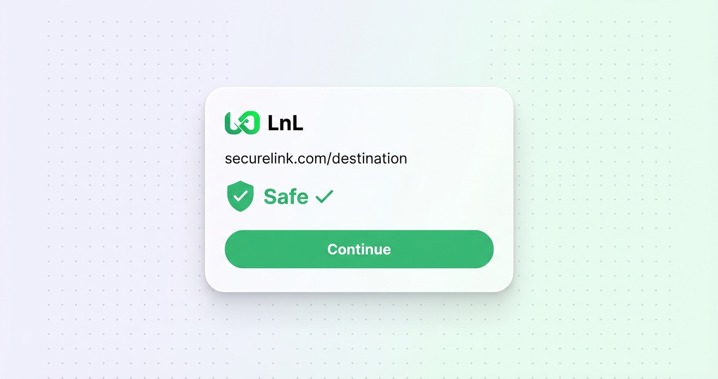
When someone clicks a link with preview enabled, they land on a checkpoint page that shows:
The goal is transparency, not friction. Your audience sees where they’re headed, they see that the link has been checked, and then they arrive. You can pause the countdown and stay on the preview page if you want.
The reason we made this opt-in is that the feature only makes sense when it’s a deliberate choice by the link owner.
If a preview page appears on every link by default, it just feels like something is wrong. But if you’ve chosen to enable it — maybe because you’re sharing links to external resources and you want your audience to see that you’ve vetted them — then it makes sense in context. It’s a signal that you care about where you’re sending people.
Forcing it on everyone, especially to run ads, is the opposite of that.
The preview banner is available on paid plans. I’m not going to dress that up — building and serving those pages takes infrastructure, and it needs to be supported somehow. But the default behaviour (immediate redirect, no preview, no ads on your links ever) is how all links work regardless of plan. We don’t run ads on your links. That’s just not something we do.
If you’re on a paid plan and want to give your audience a trust signal before they land somewhere, it’s there. If you don’t need it, your links will keep redirecting instantly. Your choice, not ours.